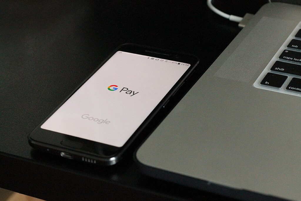
Earlier this year, Coinspeaker reported Google Wallet and Android Pay has been united to form a single platform for online payments named Google Pay. The announced merger was pursuing a goal to bring together all the ways to pay without having to get your card from the wallet.
Notably, this uniting managed to save the most lucrative features of both Google Wallet and Android Pay, therefore being not just a rebranding, but a crucial change to the underlying technology. For example, much alike Android Pay, Google Pay also serves as a loyalty platform storing gift cards, tickets and coupons obtained when shopping at one’s favorite stores.
However, on the first place, Google’s digital payment platform enables users to make power in-app and tap-to-pay payments on their smartphones, as well as other connected devices such as smartwatches and tablets. The newly updated desktop design of the Google Pay was redeveloped in simpler and more user-friendly way. Moreover, along with seamless payments on the web, the app’s users will be able to enjoy the transparent record of their transaction.
Google Pay allows point-of-sale payments and tap-to-pay funds transfers in some countries, where users can upload their credit or debit card information and use near field communication (NFC) in their phones or other devices to make payments. Similarly, users can also use Google Pay to transfer funds to other users using an email address or mobile number.
Google Pay does not require specific contactless payment terminals, and can work with existing terminals.
Since rolling out the revamped version to Android devices and Chrome, Google made it available to Firefox, Safari and iOS. Now the desktop version has received the same facelift as the app.
Google chose the New Material Theme to refresh the outlook of its platform. The theme is widely used by other Google’s apps such as Gmail, Google News and Google Home. The brand notes that its use of white space, the four colors and its custom font, Google Sans, all work together to “convey a familiarity and trust” to its users.
In addition to the aesthetic changes, there are a few new features listed including a record of purchases, subscription management and the change of a payment method. Additionally, there are plenty of updates regarding the extension of additional support to different countries.
The new look and features simplify the interface significantly. With the redesign, users can now see activity that shows a list of the recent spends, payment methods can be added and removed, while you can easily switch your bank accounts saved with Google. The subscription tab, in it’s turn, serves a place from where you can check out or manage all your subscriptions, presenting the ability to edit other information regarding billing address, name and so forth.
Sofiko is a freelance fintech copywriter at Coinspeaker.
With a Bachelor degree in International Business and Economics, Sofiko has been deepening her knowledge of an agile innovative industry primary focusing on the robust blockchain technology and cryptocurrencies. As a bank employee, Sofiko particularly keens on crypto and blockchain integration into the established banking systems.